Automated translation with Google
What's happening to mobile commerce and mobile sites in general? Until recently, it seemed that all sites needed a responsive design compatible with smartphones and tablets to compete and sell online. Google itself seemed to penalize sites that didn't have mobile-friendly graphics in its search results. In many cases, sites with interesting, frequently updated content-non-mobile, old-fashioned are much more visible.
We're also realizing that, in practice, sales generated by browsing mobile sites on smartphones are largely insufficient precisely because poorly organized mobile sites are frustrating and annoying. Consumers will never recommend companies with poorly designed and implemented mobile sites to friends and acquaintances.
In short, the problem with mobile sites: the underlying problem is that mobile strategy, especially when it comes to smartphones, has often been reduced to "squeezing a site's content onto a screen smaller than a PC." Users are perfectly aware if a site is difficult to navigate on their mobile phone, and if they're dissatisfied, they abandon it and won't recommend it to others. Long menus and pages, poorly resized images, poorly laid out text, redundant, repetitive, and poorly conceived links are the most common errors that discourage mobile browsing.
It seems that companies have addressed this issue too superficially. It's safe to say that an online marketing and sales strategy cannot rely on a mobile site for smartphones to achieve significant results.
The Mobile Layout Problem: Especially in mobile environments, site navigation itself is dictated by the modes, with no way to skip uninteresting content, zoom out for a quick overview of a page's content, or even indicate how much content to scroll through to reach the end. You can't dominate the site; you have to endure it. Many consider this frustrating and a real navigation problem.
It makes it difficult to reach the site's footer, where companies often provide important information such as company details and contact information. In general, infinite scrolling on mobile devices is unsuitable, especially for e-commerce sites, as the goal is to enable users to quickly find the product they're looking for. On the other hand, this solution can be appreciated on entertainment sites.
It's also important not to overlook SEO: drop-down menus and miles-long pages, being solutions based on technologies that Google's bot may not run, require special care to ensure all page content is properly indexed.
To put it bluntly: have you ever seen a car that changes size, shape, and layout depending on the type of road it travels on? For example, an Italian car, of any make, has its own dimensions and its own technical and aesthetic components: on an Italian road, neither wide nor narrow, it will feel right for itself and its users. On an American road, wide and spacious, it will feel small, but it will always be complete and functional, right?
Not with the Internet, it doesn't work that way! Websites must adapt to their devices: small, narrow, obnoxious, and infinitely long on mobile, more or less adequate on laptops or desktops, exaggerated, enormous, and with pages filled haphazardly, like "1, 2, 3, mess!" on desktops with very high resolutions, which disregard every rule of good communication, with redundant menus and links that never let you know if you've visited the entire site. Remember that the main rules for creating a good website were precisely to make every link predictable and to ensure that the user is always informed about the section they're visiting.
Not now, we're back to "1, 2, 3, mess!" because the important thing is to create pages. The home page? Usually something unwatchable, with a "link salad upon link salad" that creates anxiety. In short, enough with all the originality that disrupts the joy of browsing!
What solution can be applied to counteract this "trend/fashion" so carelessly exploited by many Web Agencies in creating websites that, among other things, all use the same Content Management Systems? Notice, you can't tell where they came from; they're all the same, all with the same useless but overly highlighted graphic effects. Be careful, in reality, all the sites are signed as "web designers," but the reality is that "all the authors simply adapt things already done by others" and charge a fortune for it! For example: images that move or change color when you hover your mouse over, or background videos for entire pages or portions of pages: they know how to apply them, but they have no idea how to do it! Everything has already been decided by a few idiots paid to do nothing else from morning to night, and who think they're in charge of everything and everyone! We, who know we have a brain and know how to use it, who believe in our own way of thinking, will hardly adapt to their presumption, and so, we must move forward only in our own way! Let's get to the point: what's the solution to the endless scrolling up and down pages that leads to difficult and unproductive navigation of your website's web pages?
In our opinion, with twenty years of experience building websites, we need to take a step back to make many steps forward: a return to simple websites, always similar to themselves, "as is" wherever they are viewed. Websites we've dubbed "TEL QUEL" in French, meaning they maintain the same position of text and photographic elements, ensuring visibility wherever they are displayed, whether on various PCs or mobile phones, perfectly manageable and guaranteeing carefree navigation in any environment. Ironically, the mobile environment seems to offer the best navigation! Tel Quel websites, respecting character sizes, image sizes and textually interesting content are extremely mobile-friendly, beyond any rules imposed by those who command or think they command everything!
Built with tools from over 30 years ago, such as Windows FrontPage, perhaps obsolete but still functional languages like Windows ASP, rigid structures, precise positioning of elements, yet always perfectly zoomable, which allow you to view groups of text or photographic elements and scroll through pages at will, with complete freedom, taking advantage of all the features offered by the mobile environment.
A style that certainly goes against the grain, open to criticism from those who present themselves superficially and with little experience. Sites that "make no mistake", which we might call "timeless", generate leads and get straight to the point: being visible, engaging, navigable, partially self-updating (such as news, photo galleries with photos and descriptions, product catalogs/e-commerce sites) and finally modular, meaning they can grow over time, with our input, like components, without having to redesign them from scratch.
Finally, consider the number of users still using obsolete operating systems and outdated browsers. For commercial purposes, in the interest of our clients, the primary goal is to make a website's content accessible to all those who, for a variety of reasons, are unable to use properly updated tools.
We have no way of knowing what the future of information technology will bring. Especially given the prospects opened up by artificial intelligence, which will undoubtedly pervade the mobile world, disregarding the criteria for proper navigation. The key will be to achieve "something" in the shortest possible time with textual originality, disregarding old requirements.
The only certainty we must pursue is that with the tools of today, yesterday, and tomorrow, simplicity of execution will ensure we achieve the communication and sales objectives of our clients, both present and future.
For our part, we offer responsive and mobile-friendly websites, but with minimal and clear menus and links. Since we, as good Italians, enjoy a challenge, we also offer the "TEL QUEL" approach, all our own, atypical, unique, and unconventional, born directly from the experience gained over years of work, rigorously handmade, Handmade with highly tested Microsoft products and which produce results in visibility, data usability, real-time updates, and surprising contacts/sales.
It's not our intention to bore you further on this topic. We simply felt it was our duty to inform you of our perspective and our ability to offer our comprehensive services conscientiously and responsibly.
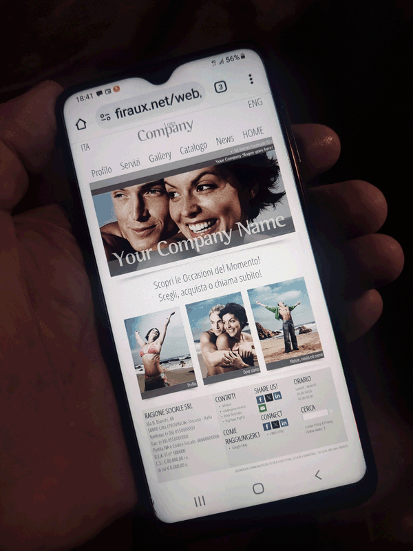
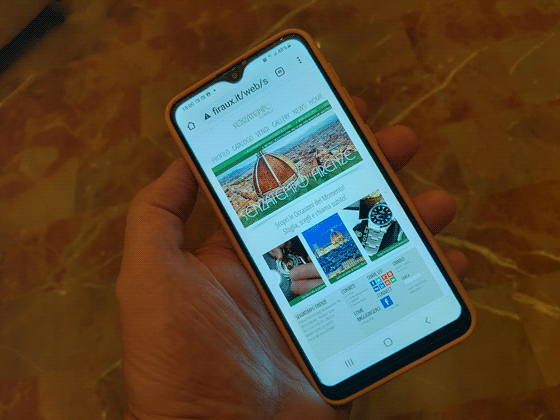
Attached are images of the environment/site of a project:
26/11/2025 |


